|
My devoted reader(s?) will recall that I have
an unhealthy interest in
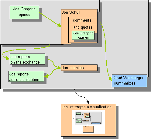
visualizing information, especially meme flow. The advent of Kartoo, Trackback, and a recent exchange with Joe Gregorio which has now ramified to Dave Weinberger sets the stage for this little experiment. (Later, I'll entertain comments on whether this is a quixotic research program, and whether one can imagine an automated visualization process along these linesl But right now, I have a windmill to tilt at.). First, I did the usual boxes and arrows, using color and shading to add information and reduce visual complexity. I think its understandable, but "too busy". Besides, does it add value? |
|||
 |
|||
|
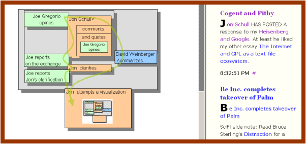
Then it occurred to me that the arrows could
be eliminated by adopting some perhaps-intuitive conventions.
Sequence-of-creation --> Up-Down progression. Direction of influence (inferred from linking) --> Back-front "underlap". Identity of Author --> Color and lateral position. Boxes are nested when they are part of a larger whole. Part-Wholeness --> nesting part-wholeness can be intrinsic to a message (as in the first Orange box) or it can can be imputed after the fact by an observer. (The grey box) etc. The green curved arrows are, thus, redundant (but helpful) Anyway, at the last minute I realized that I could attach hyperlinks to visual objects (I'm doing this within MS Excel) and that I could save this as a web page. I wasn't surprised to see that IE can render the resulting HTML but I am surprised to see that the Opera Browser does too. |
|||
 |
|||
|
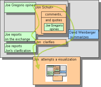
I think this does add value, especially since the Opera
Browser lets me
create a linked window thus turning the visualization into an ever-present map (rather just another page to jump to and from). The net result is something like this: |