Getting the right user interface for RSS aggregators is both intriqing and important. RSS is encompassing more and more of our common data stream and we need ways to customize its display to suit individual needs. In particular, I'm still interested in something that was discussed quite a bit last September, the
digital dashboard concept, with RSS assumed a central element. There was some debate about whether the dashboard concept was good or bad, but little was settled. Now we have a series of arguments around the proper UI for RSS aggregators:
Interfaces for aggregators.
Dave Winer thinks Radio Userland has a better interface for reading RSS feeds:
RSS readers that work like Usenet readers are a waste of time, imho. Aggregators should not organize news by where items came from, just present the news in reverse chronologic order.
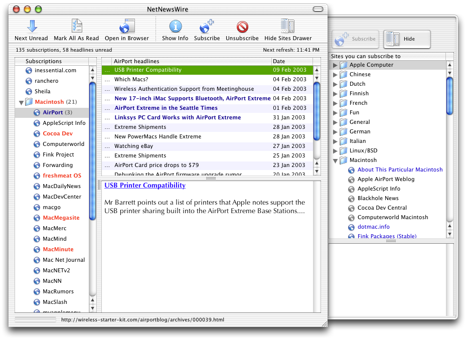
Of course I disagree. I was turned off by Radio Userlands HTML-based interface long ago and I switched to NetNewsWire because it offers exactly what Dave considers to be a waste of time. Radio Userland keeps me away from organizing myself. [...] [Oliver Wrede]
I can only second Oliver's assessment of Radio Userland's aggregator interface. Only Mikel Maron's myRadio tool comes to rescue the user who wants to organize and cluster her RSS feeds in Radio. MyRadio is a big improvement but has serious interface problems, too. [...][Sebastian Fiedler]
[Seblogging News]
I continue to believe the RSS will play a critical role in the dashboard concept and can't imagine there is any rational basis for asserting the
only way feeds should be presented is in reverse chronological order. That makes some sense within a specific feed, but it is hardly helpful if you have hundreds of posts from different sources. It is perfectly valid to sort feeds based on origin, topic, or theme depending on your use. Most likely some combination of all three. Moreover, the user should be able to decide what portion of the post is displayed -- e.g. pick the headline, an excerpt, or the entire feed. In short, an RSS aggregator should allow a user to organize data along whatever axis, and in whatever fashion, desired. Just as in structuring collaborative systems, the idea of imposing a single way of thinking, or working, on the user is the surest way to ensure a system won't be used. I haven't used Radio's default aggregator for months. Despite Dave Winer's comment above, it's terrible. The default Radio aggregator is a barrier to getting new Radio users heavily into RSS management. But Radio combined with
Mark Paschal's Kit, which provides time-based filtering and full-text search, plus
Mikel Maron's myRadio, which provides categorization and grouping, create about as good an aggregator experience as I've been able to find. (Yes, myRadio does have some significant UI issues of it's own, but it's far better than Radio.) For reference, I've used both AmphetaDesk and FeedReader on Windoze. As for the dashboard concept, it
continues to grow in both its breadth and its use. [
b.cognosco]


