|
REVIEW: A Preliminary Investigation of Energy Return on Energy Investment for Global Oil and Gas Production. This post reviews a paper by Nate Gagnon, Charles Hall and Lysle Brinker titled: âo[ogonek]A Preliminary Investigation of Energy Return on Energy Investment for Global Oil and Gas Production,âo[caron] published recently in the peer-reviewed journal Energies. The lead author was my colleague for two years at SUNY-ESF and the second author is currently my Ph.D. advisor and has published numerous guest posts here on The Oil Drum. See here for a list of previous posts relating to work by Dr. Charles Hall, and here to download a full-text PDF of this paper. EROI of Global Oil and Gas Production 
As the title of this article indicates, the authors estimate the energy return on investment (EROI) for global oil and gas âo[ogonek]production.âo[caron] The first thing to note is that the calculation is actually for the EROI of global exploration, development, and production (commonly called E+P or âo[ogonek]upstreamâo[caron]) âo[base "] a much more comprehensive estimate than just production. They estimate that the EROI of global oil and gas E+P in 2006 was roughly 18:1 (above figure). To establish these estimates the authors rely on three datasets: a) the Energy and Information Administration (EIA), and b) the British equivalent of the EIA, and 3) John S. Herold, Inc., a privately managed database consisting of data on total "upstream" costs (i.e. all costs up to the point the oil comes out of the ground) of publicly traded energy firms around the world. The crux of their analysis depends on the conversion of money numbers into energy numbers. Since global energy costs are not maintained in energy units, but in economic units only, they derived an energy intensity value for each dollar spent in the energy industry. These numbers, derived independently for the energy industries within the U.S. and England, were about the same: roughly 20 MJ per dollar for both countries in 2005. The energy intensity numbers were multiplied by the estimates of money spent to get rough estimates of energy cost of energy production. In addition to estimating the current upstream EROI of global oil and gas, they extrapolated three trends from their time-series estimates of EROI and show global EROI declining to 1:1 between either 2022 or sometime in the very distant future, with the best estimate being about three decades away. To do this, the authors forecast linearly the historic trend of global EROI, which is, as the authors acknowledge, a forecasting methodology fraught with problems. Nonetheless, the forecasts provide a thought-provoking view of what may happen if society continues along a "business as usual" path. Linear extrapolations of historic EROI trends 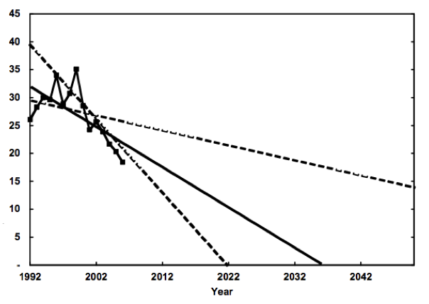 The authors also attempt to answer the question âo[ogonek]What are the reasons for the decline in EROI estimates, especially since 1999?âo[caron] They offer two solutions: 1) technology is seemingly being outpaced by depletion, and/or 2) increasing the annual drilling rate decreases the drilling efficiency. The drilling intensity decreased during the early and mid 1990s when EROI was actually increasing, but has increased since 1999. This has led to a sharp decrease in drilling efficiency (barrels found/produced per well drilled). Their best guess is that both options are operational, a contention with which I am inclined to agree. Improved technology is increasingly used in E+P activities, including, of course, drilling. So the fact that the EROI of E+P has declined over the past 10 years indicates that easier-to-access resources, i.e. high EROI resources, are increasingly rare (if found at all), because even with increasing technology and drilling efforts, we are witnessing declining EROI. Lastly, the authors address the major assumptions they have made while performing their analysis. This is a crucial step in most large numerical analyses and, unfortunately, one that is often overlooked. The assumptions are: 1) âo[ogonek]changes in monetary expenditures indicate changes in energy expenditures.âo[caron] The second assumption is the most problematic from a scientific perspective because upstream costs vary widely from deep offshore, to tar sands, to shallow offshore, to onshore drilling. The application of energy intensity numbers, which are derived directly from cost data, from one area of the world to the rest of the world is potentially flawed. But in reality, this is a reflection of one of the conclusions the authors derive from their work, i.e. WE NEED MORE/BETTER DATA. The fact of the matter is that although the authors had access to three extensive data sets, two public and one private, they were still able to access data for only 40% of the worldâo[dot accent]s oil production. Furthermore, many of the data sets that are unavailable to public scrutiny are the most important, i.e. that from Saudi Arabia, Russia, Iran, and every other Nationalized Oil Company. Some interesting quotes from the manuscript:
[The Oil Drum: Net Energy - Discussions about Energy and Our Future] 4:02:39 PM |
|
CPRS in Crikey. I have written a ‘Clarifier’ for Crikey today on the CPRS. It is reproduced over the fold. <a style="display:none;" id="ddetlink117850614" href="javascript:expand(document.getElementById('ddet117850614'))">Read the article <script>expand(document.getElementById('ddet117850614'));expand(document.getElementById('ddetlink117850614'))</script>
Crikey Clarifier: CPRS Schemes Joshua Gans, Crikey, 12th August 2009. What is a “cap and trade” plan? Both the Government and Malcolm Turnbull are putting forward “cap and trade” plans to ensure that Australia plays its part in reducing global greenhouse gas emissions. Such emissions are the quintessential example of what economists call “externalities” whereby the private actions people take (in this case, consumption and production in general) have consequences that are more widely felt (in this case, pollution). We have too much pollution because we treat it as something we can do for free, so economists argue that it needs to be priced. One way to achieve this would be to price it directly. That is, decide what harm each unit of emissions is doing in monetary terms and tax the emitter accordingly. This carbon tax is direct but has the disadvantage that you have to work out the price. That is the hard part as science tells us what level of emissions to target and economists can only guess at the price that will achieve that target. Instead, thinking in market-terms, economists suggested rationing the emissions directly. So instead of having the Government set the price of emissions, we can let the market do it. To achieve this, the Government has to issue [base ']Äòpermits[base ']Äô to emit. In the olden days, this raised the ire of environmentalists because it looked like we were giving permission to pollution; a form of approval. Of course, they were right but if done right, it was permission to pollute in aggregate no more than the environment could bear. The big advantage of emissions permits is that we can get lots wrong and still do good so long as we get the big target right. For instance, we can give permits to the wrong people who don[base ']Äôt actually want to pollute and they can sell them in the market to those who do. The permits shuffle around like deck chairs but so long as there aren[base ']Äôt too many deck chairs, the boat won[base ']Äôt sink. Of course, it is better to have a permit given to you with the option of using it or selling it than to have no permit at all. So Governments have to work out how to allocate permits. Economists like an auction model so that the Government effectively starts by giving the permits to itself and selling them. That allows the proceeds to be distributed by other means. But alternatively, Governments can cut to the chase and distribute the permits by those other means. What are the main differences between Turnbull and Government[base ']Äôs plan? The main differences between the Government[base ']Äôs plan and that proposed by Malcolm Turnbull have to do with how the permits are allocated. The Government wants to auction them all off except to “trade-exposed, emissions-intensive” industries who will get an allocation freely and be given incentives to use rather than sell them. Malcolm Turnbull would prefer to auction fewer permits off and give both trade exposed and the electricity generators free permits. The goal of having free permits is to shield those industries from big market consequences (that is, higher costs that have to be passed through to consumers) and at the same time soften the impact of the introduction of the policy. Of course, with regard to electricity generators, the Government is concerned about the impact too but instead of coming up with a way to stop those higher costs being passed through to consumers, it prefers to compensate the generators directly using the “other means” discretion that comes from a larger pool of permit auction revenues. But there is an important difference between the two. In Malcolm Turnbull[base ']Äôs plan price signals on energy come in gradually rather than a big bang. Frontier Economics, who prepared the case for this plan, argue, and this is consistent with Treasury modelling, that electricity demand does not change in the short-run but after that it can change as people buy energy efficient equipment. So, as a matter of economics, it is tomorrow[base ']Äôs electricity price signal that matters and not today[base ']Äôs. Hitting people today is like some sort of tax with short-run economic costs. There are several reasons to be doubtful about this logic, however. First, if short-run demand is truly insensitive to price, then a hike in prices hits household budgets but presumably that is what the compensation to households was supposed to cover. So we can either not have the hike and forego permit auction revenues for household compensation or we can have it and compensate households using those revenues. I can[base ']Äôt see where the cost arises. Second, there is much to like about the economic model whereby future price signals drive decisions but there is plenty of reason not to place too much faith in it. Short-run price signals matter and combined with good information they can work to change behaviour now. It isn[base ']Äôt all about durable appliances but how we use electricity at the moment. Shielding users from those signals is likely to be a risk not worth taking. It is better to get prices right and soften the income issues with compensation. That is the standard economic approach. What would be a better way to deal with electricity? Rather than compensation which, whether it be cash or permits, has a tendency to stick, a better way forward is to raise the regulated price cap on electricity to final consumers by some margin, say 20 percent, over the next few years. In return for that, retailers will have to put in smart meters into households. The twin effect of that will get some behavioural changes at the user end. But the short-run effect will be to see more money available in the electricity sector and so a big incentive to move quickly on new investment. And what new investment will that be? Ones that economise on emissions in the long-term. How can Turnbull’s plan promise a deeper cut in emissions if it costs industry less and cuts less jobs? If there is not much extra going on with the electricity plan, where does the big gain in Turnbull[base ']Äôs plan come from? The big factor driving the Coalition[base ']Äôs potential “free lunch” of tighter emissions and lower costs were measures to allow for more trade in international permits.¬[sgl dagger]These are a good thing. In my mind, it is the single biggest reason we need a good, workable and widespread international agreement. But let[base ']Äôs be clear, allowing more of this in the future is not a [base ']Äòmake or break[base ']Äô issue for the Government[base ']Äôs legislation. That legislation can be passed without this and have precisely the same short-term effect. The Coalition can then run on permitting the change later and having a real debate. To knock down the legislation on this issue is a mistake. That said, if the Government wants to allow for more trade contingent on international agreement and this will secure Coalition support, then why not do it? In the end, the Government and Coalition are too close together to have politics block this. Do a deal and let us get on with it. Joshua Gans is an economics professor at Melbourne Business School. He writes on these issues at economics.com.au. 3:00:06 PM |
|
5.8% unemployment. Once again, the labour market data in Australia shows a remarkably robust labour market, with seasonally adjusted unemployment stable in July at 5.8%. ANZ CEO Mike Smith last night stated that he saw unemployment here stabilising at 6%, which would be remarkable. The problem is that that would require a fair pick up in the economy in the second half of this year, which is¬[sgl dagger]possible, but far from assured. The latest ANZ forecasts on their webpage have GDP growth through 2009 of 0.3%, which is about what I see from other banks. Estimates of Okun’s law for Australia (see page 130 of our textbook for a quick literature review) suggest that about 3 to 3.5% GDP growth is needed to keep unemployment stable. Every 1.5% lower GDP growth is associated with 1% higher unemployment. So we would expect that zero GDP growth in a year would see unemployment rising by about 2 percent. In the first half of this year unemployment rose by 0.9%, and GDP growth will probably be around zero to 0.5%. To stop unemployment from rising well above 6% and much closer to 7% by year end is going to require a strong pick up in the economy. That’s not impossible, but is far from a sure bet. The other interesting factor in the data is the continuing strength of the part-time labour market.¬[sgl dagger] Since January full time jobs have fallen by 117,000, while part time jobs are up by 109,000. The 107,000 person increase in the unemployment rate is due to labour force growth (with the participation rate basically stable).¬ 11:23:23 AM |
|
Australia's next great challenge?. Last night the new Executive Director of the Lowy Institute,¬Michael Wesley,¬gave a short presentation in Melbourne, with the broad theme being that coming years are likely to see Australia facing the most¬challenging global environment in our history. Key to the argument is the idea that as emerging markets develop, the demand for a limited supply of natural resources will grow, and potentially create conflict.¬ My initial reaction was that it wasn't obvious to me that this should be true. As economies grow and develop they become more service oriented, and eventually less dependent on natural resources to drive growth. Measuring this precisely is not straightforward, but let me give you some numbers, some of which come from a piece by Andy Rothman at CLSA in Shanghai called “China eats the world.” In the end Wesley may have it right, though not certain as you can see from the details below. In 2004 China consumed 20% of the world’s aluminium, 32% of iron ore, 28% of steel, 22% of copper and 31% of the world’s thermal coal. All of these shares are above China’s global population share. In other words China is already consuming more than “its share” of global natural resources output. Why? Because China is industrialising and urbanising, both of which are resource intensive. Construction and infrastructure creates the demand for more than 60% of China’s steel, and therefore iron ore demand for example. There is no doubt that China will continue to urbanise for another 20 years or so, but at that point China won’t need to grow it’s infrastructure as quickly as today, and the speed of urbanisation will have slowed down. India is about 15 years behind China in terms of resource demand, so it’s quite likely that there will be very strong demand for natural resources for¬about another 30 years originating from those two countries.¬At about¬that point China’s population starts to decline, and resource demands due to urbanisation and infrastructure needs should slow significantly.¬ With China probably at about the peak of its construction and infrastructure phase currently its share of global resource demand is likely to slowly shrink in coming years, and my guess is that India will slowly grow its share over the next ten to twenty years to make up for some of that shortfall. Another 20 years or so¬[sgl dagger]is of course a long time for strong natural resource demand, but it isn’t forever, and China’s natural resource demands are likely to slow well before then, so what happens in India is a very important unknown element in the story. It’s also the case that China and India will likely be a lot more efficient than the US or Australia in terms of resource efficiency – if prices stay strong recycling becomes more attractive, subways become more attractive than autos and so on. In 2050 China and India will be around 35% of the global population. The big wildcard is Africa, which at that point will have more than 20% of global population – will Africa industrialise and continue to drive natural resource demand beyond 2030. That’s possible, but Africa is also rich in its own natural resources, so that wouldn’t neccessarily create global tensions with regard to natural resource demand. The twentieth century trend was for a very slow decline in commodity prices. Twentieth century urbanisation and economic growth did not lead to growth in demand for food and commodities above that which markets could supply.¬[sgl dagger] The main explanation is technological change – in agriculture leading to more efficiency and in mining leading to lower cost and more discovery. What is different now is that China and India are rising very quickly, and their populations are a very large share of global population so that commodities demand is growing too quickly for technological change to hold down prices. But that won’t happen forever. Putting all of that together it would be reasonable to expect strong demand for natural resources in the next twenty years or so, and some conflicts around that, but I’d expect to see that confict to slowly dissipate in future years. And even within that twenty years its not clear that we will continue to see demand growing stronger than natural resource markets capacity to supply. The bad news for Australia is that the long downward trend in commodity prices might not yet be dead, though we’ve probably got a while yet to enjoy the mining boom. Natural resource conflict might be one issue facing Australia in coming years, but I’m guessing that there will be plenty of other equally interesting challenges. 11:21:28 AM |
|
Inequality and Growth. I have a new paper out with Dan Andrews and Christopher Jencks, on the relationship between inequality and growth. We reach a finding that is pretty standard in this literature [base ']Äì when we restrict the sample to 1960-2000, more inequality seems to be good for growth. However, if the inequality arises from a transfer from the bottom 90% to the top 10%, we[base ']Äôre skeptical that the bottom 90% get enough back in growth to make up for their loss in share. Here[base ']Äôs the abstract:
The paper was written up in the Wall Street Journal last Tuesday, under the headline [base ']ÄúTrickle-Down Economics Fails to Deliver as Promised[base ']Äù. Here[base ']Äôs a snippet:
9:48:05 PM |
|
Gov2.0 in the Age. I have an opinion piece in The Age today on Government 2.0. Joshua Gans, The Age, 6th July 2009 (see also WA Today)
The Government’s tight control of public information is outdated. UNLOCKING the information collection by governments [base ']Äî and deciding what information could be of social value [base ']Äî is the aim behind the new ‘Government 2.0′ taskforce headed by economist Nicholas Gruen. The taskforce’s mission results from a key recommendation in the Cutler Review on Innovation [base ']Äî a taskforce that Dr Gruen served on. In BusinessDay last August , I highlighted an example with regard to the free availability of public toilet location information [base ']Äî also mentioned in the Cutler review because that information had actually been collected as part of the National Continence Management Strategy and gave Australia perhaps the most comprehensive toilet location map in the world. However, that information was provided only in ways the Federal Government chose to and it could not easily be viewed on a mobile device. That has improved, but not to the extent of allowing developers to match the information with devices in a truly usable manner. Google Maps might have been invented in Australia and they can pull all manner of data [base ']Äî except our toilet locations. But this is just the tip of the iceberg. Schedules for public transport, TV and radio programming, emergency room information and traffic sits locked within the Government. So the mission of the taskforce to find ways of bringing it out is clearly a critical one. They will face challenges. Politicians and bureaucrats do not give up control of information lightly. The taskforce will hear excuses. First, it will be claimed that free use of the data means the Government cannot certify its integrity. That may be the case, but is it really necessary for it to give such certification? Surely our consumer laws are strong enough to accept clear labelling from those repackaging the information that things may not be up to date. Search for exchange rates on free sites and the disclaimer is there. Even so, the taskforce should not settle for that. It should be the duty of the Government to not just post some spreadsheets on a website but to work out protocols that, if changes occur, allow those drawing from the information to update it accordingly. Twitter and Facebook provide developers with this ability in real time. Surely, the Government should be expected to do the same thing? Second, there are issues of privacy. Dr Gruen highlighted NSW information on popular baby names from the Registry of Births, Deaths and Marriages as an area where governments are getting it right. But that same information excludes really unpopular names because they might identify (presumably the birth year) of certain people. That might be possible if your name is derived from Klingon but surely that isn’t a strong reason to limit searches. For instance, you could identify unpopular names by decade rather than year. These demonstrate the challenges that might come from complacency. But Dr Gruen’s baby names’ example highlights another. He was enamoured with a particular representation of the data as a graph showing 1200 baby names over time. You can hover over bits of it and find out just how many NSW babies had a name in a given year. Perhaps it was neat technologically but it was, in many respects, of no real value. At best, it told you trends of gender-based names around certain areas of the alphabet. The point is that it shows us that we can do better and indeed, it is precisely why the Government needs to free the information so that others can provide it in a useful form and improve on it. The problem is that when it comes to NSW baby names, despite the flashy graph, that data is locked within Government. You cannot request a database with the underlying information. And so no one other than Government can present it to us in a form that is actually of use. I won’t speculate on what that use might be. I just hope this is not what the taskforce has in mind because it highlights precisely the problem rather than the goal. To be fully successful, this taskforce will have to change the default position of government from tight control to open access. That said, I would be happy if beside every representation of information, there was a ‘click here to download a spreadsheet’ button. If they can’t get that, this taskforce cannot claim to have succeeded in any measure. Joshua Gans is an economics professor at Melbourne Business School. He contributes to the economics.com.au blog. 9:46:04 PM |
|
Labour market. The unemployment numbers yesterday were again remarkably good relative to what is happening elsewhere in the world. The headline u/e rate is up to 5.8%. Since July last year we’ve lost about 160,000 full time jobs, but part time jobs are up about 127,000. Of course we need to create jobs to stop the unemployment rate from rising, but compare these numbers with the US. Paul Krugman this week pointed out that the US has lost ¬[sgl dagger]more than 6 million jobs since the recession started, and it needed to create 8 million jobs to stop the unemployment rate from rising over the same period. The US labour market is roughly 12 times bigger than ours, so equivalent job losses in the Australian market would be roughly 500,000 jobs – instead we’ve lost only about 30,000. The number of unemployed has risen from 484,000 to 662,000 in Australia – thankfully, in terms of labour market behaviour we have become very much decoupled from the US. 9:42:36 PM |
|
Melbourne water bill to soar. MELBOURNE households can expect water bills to soar by up to 64 per cent over the next four years, Victoria's regulator has confirmed. [Herald Sun | Breaking News] 12:57:10 PM |
|
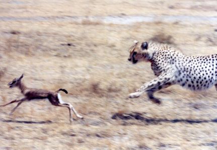
A Net Energy Parable Revisited. (**Note: This was my first main post on TOD. It was an anecdotal attempt at showing how scaling of lower energy gain renewables might have deleterious wide boundary impacts on society. The core principles behind this story remain intact and relevant). Besides water, energy is the most important substance for life on the planet. For most organisms energy is embodied in the food they eat, be it bugs, nuts or gazelles. The excess of energy consumed to energy expended (net energy) has been integral in the evolution of the structure and form of present day organisms. Net energy is measured as how much energy is left over after the calories used to find, harvest, refine and utilize the original energy are accounted for. It is a term linked to physical principles and departs in many cases from our current market mechanism of valuing things by price. The alternative energy debate seems to have two firmly entrenched camps - those that acknowledge the importance of energy gain to our society and those who focus on gross energy, energy quality and dollars. This post explores what net energy is, why its important and how its principles may impact the future organization of our society. [break] For most living things, energy is calories. Over eons, natural selection has optimized the most efficient methods for energy capture, transformation, and consumption.( Lotka) Cheetahs that repeatedly expend more energy chasing a gazelle than they receive from eating it will not incrementally survive to produce offspring.
WHAT IS NET ENERGY? To harness and consume energy requires some type of energy investment. This investment is what comprises the difference between gross energy and net energy. There is various nomenclature that describes this concept. Energy profit ratio, surplus energy, energy gain, EROI, and ERoEI all represent virtually the same relationship of how much energy we receive, relative to an energy input(dollars do not factor in). The most referenced metric in the Peak Oil literature is EROI or ERoEI (Energy Returned on Energy Invested), which, in its simplest sense is the ratio: Energy Output / Energy Input There is disagreement (sometimes dramatic) in the energy literature not only as to what should be included as energy inputs and outputs (a boundary issue) but how variables are included (how to evaluate co-products, how to include other limiting inputs to an energy technology, etc) These nuances will be covered in a subsequent post.
Net energy is typically given as per unit of energy invested. Thus: EROI = Net Energy + 1. (For those of you who've played craps - some tables pay off the hard-ways FOR one and others TO one. EROI and net energy have a similar relationship. EROI is how much energy output FOR an energy input and net energy is the energy output TO the energy input.) Net energy also can refer to a sum as well as a ratio. For an ethanol process that has an EROI of 1.2:1 -the net energy is just .2, but we can also calculate how much net energy is created for society in a given year or a life-of-resource total. At EROI of 1.2, the 3.9 billion gallons that the US produced in 2005 required 3.29 billion gallons of BTU energy input, resulting in a `net energy' of 610 million gallons. (This post will use net energy and EROI interchangeably - if a sentence uses EROI, just subtract one to get net energy, if I use net energy, just add one to get EROI)
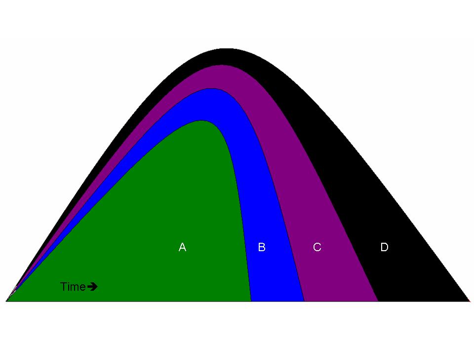
A GROSS vs NET ENERGY GRAPH
Briefly, the above graph shows a theoretical depletable resource which follows the 'best first' concept of resource extraction. The vertical axis is quantity and the horizontal is time. The gross energy resource "X", is the entire area under the curve. ("X" = "A"+"B"+"C"+"D"). Direct energy costs are "D". Indirect energy costs (like tractors and highways and medical insurance and such) are "C". Environmental externalities (in energy terms) are "B". "A" represents the total net energy of the resource after costs have been subtracted. At any given point in time the EROI can be calculated by taking a ratio of the total area divided by the costs (depending on the boundaries). As can be seen, net energy peaks and goes to zero way before the total gross energy is depleted. (This graphic is from an upcoming paper on EROI by a colleague (Kenneth Mulder) and myself.) ENERGY QUALITY Energy quality is also relevant. From an economic standpoint, the value of a heat equivalent of a fuel is set by its price, energy density, physical scarcity, cleanliness of the fuel, capacity to do useful work, flexibility, safety, conversion aspects, etc. (1)
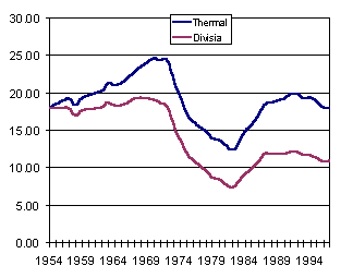
Electricity is currently the highest quality energy we have in our society, largely due to its ability to do work. Although crude oil is of lower energy `quality' than electricity, its use is ubiquitous in allowing other segments of society to transport goods, etc. and its `quality' as measured by price, has been increasing relative to electricity in recent years. Cutler Cleveland et al. devised one method of `quality correcting' the net energy of oil and gas extraction using, The Divisia Index, which accounts for energy quality of both inputs and outputs(1 )Below is a graphic of the the thermal and quality corrected EROI of US oil and gas extraction.
"The Divisia EROI is consistently much lower than the thermal equivalent EROI. The principal reason for this is the difference in the fuel mix, and hence fuel quality, between the numerator and denominator of the EROI. The outputs are the crude, unprocessed forms of oil and natural gas. The inputs are electricity and refined fuels such as gasoline and other distillate fuels. The latter are higher quality than the former, and have higher prices. Refined fuels and electricity are, therefore, weighted more heavily in the Divisia formulation."(1)
In the 1930s, US oil was easy to recover. In many cases it was almost at the surface and had an EROI of 100:1.(2). It has since declined, depending how one measures it or who one talks to, in the range of 10-15:1. As it gets deeper, harder to find, more viscous, higher sulfur content, etc, the EROI will continue to decline. A typical refining efficiency is about 10:1, so the total refined EROI of our precious liquid fuel is still between 5-10:1. This may not seem so high (compared to 100!), but how many stocks have you owned that make 500-1000%? On each iteration? This is the type of energy subsidy world society has become accustomed to.(My paucity of references for this segment gives evidence to how little concern our leadership has for the issue of net energy. Charles Hall, (with data from John S Herold and Co.) and others are working on new updated oil and gas EROI numbers - but solid energy data is either proprietary or difficult to assimilate)
WHY IS NET ENERGY IMPORTANT?
We all intuitively know the difference between net and gross - we use the concept everyday. If you make $100,000 per year in salary and the government takes 38%, your net is $62,000. If the government took 99%, it really wouldnt matter whether you made $100,000 or $1,000,000, your take home would be very small. The same concept applies to energy, and in particular, whatever energy source is most central to society. Basically, net energy matters because net energy is what we use.
"Energy gain, or EROI, varies with the quality (transformity) of a resource deposit and with the efficiency of the technology used to locate, extract, process, distribute and exploit the resource. As the ease of obtaining or using a resource declines, more energy must be devoted to these activities, causing energy gain to decline. Where an energy budget is substantially constant, allocating more resources to energy production reduces the amount of energy available for other activities. The potential impacts of such a situation on a human system include less leisure time, a lower standard of living, higher taxes, and an increase in childhood mortality. In an animal population, allocating greater effort to energy production may mean less winter fat, increased embryo resorption, lower birth weights, or the like.Tainter(3)
It is fundamentally impossible to maintain a constant level of net energy while the aggregate energy profit ratio drops. Only after the energy profit ratio and the need for new fuel related level off can net energy supplies return to the desired level (4).(This book, Beyond Oil, is 20 years old, but is probably the best book on the concepts of net energy, agriculture and society)
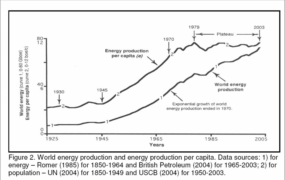
We are currently living in the highest energy gain era of any organism in the history of earth. Although the total amount of BTUs consumed in 2005 was higher than any year in history, world energy per capita peaked in 1979.(5)(One could argue that the plateau in net energy per capita has been maintained by a large wealth transfer from poor to rich, from future to present, and from abstract 'energy' (debt) to real consumption). There are a finite amount of stored fossil fuels on the planet. Some of the largest, highest quality resources have already been exploited. The remaining resources are in many cases more energetically difficult to harvest, or have negative side effects (e.g climate change and coal).
"Environmental degradation is greater when the resource is of low quality and distributed but heavily used. Thus, a switch to renewable energy sources might bring, ironically, environmental damage comparable in scale to, or greater than, that caused by the use of fossil fuels." (Joseph Tainter)(2)
We already see evidence of this in some of the scaling of biofuel production in Asia
A NET ENERGY PARABLE Net energy of corn ethanol examples and debates have been presented ad nauseum from both proponents and detractors. The redundancy is trivializing the concept. Though the ethanol debate is critically important in deciding how to deploy of our remaining fossil energy, what follows is a more benign example:
A civilization of 1000 sasquatches lives on a small distant Planet P. They require only food (energy) and water to live but also enjoy a vibrant culture with artisans, builders, and craftspeople. Sasquatches are vegetarians (as everyone knows) but do raise animals for labor help, namely Hephalumps. These animals help them harvest large hempy plants from the mountain near where they live and process them into Saspacks (the finest, sturdiest, durable backpacks in the universe). Each week (which is 10 days long, based on Planet P's sun), the sasquatch colony works very hard for five days and then has leisure time during for the next 5 days. Once a year, a ship from Planet X lands and trades luxury food items (non-caloric but tasty), medicine, comic books, and basic materials in exchange for an agreed upon cargo of Saspacks. We can determine the energy gain (or net energy) of this society based on the above information. First let's look at the energy output: Each of the 1000 sasquatches eats 4 mcals per day and there are 10 days per week on their planet. This equates to 40,000 mcals energy consumption per Ten-Day. Each of their herd of 100 Hephalumps requires 8 mcals per day (8,000 mcals per Ten-Day) Therefore the Mongo nut energy source provides them with a flow of energy of 48,000 mcals per Ten-Day. This is their energy output, which is entirely consumed. How much energy does this society spend in order to get the 48,000 mcals? Well, 300 sasquatches work/travel for three days to acquire the Mongo nuts and then spend two days refining it into edible quality. They have to eat for nourishment during this time otherwise they would not have the strength to do work. Their caloric input (from the prior week's waybread) is 300 sasquatches times 5 days times 4mcals equals 6000mcals. The energy gain for this society is 48,000 mcals less 6,000 mcals equals 42,000 mcals per ten-day. The EROI is 48,000mcals/6,000mcals =8:1. The net energy is EROI-1 or 7:1. (Remember, EROI is FOR one and net energy is TO one.) For every unit of energy spent in energy harvesting/refining, 8 are produced. Since they used one unit to produce 8, 7 are left over for other areas of society. (Of the 48,000 mcals of energy available to their society, 6,000 is used for energy production, 12,000 is used to make Saspacks, 2,000 used for cleaning and water procurement, 8,000 to feed the Hephalumps and 20,000 to sustain the tribe during their 5 days of hedonistic leisure.) Sidenote -even though there is a 8:1 EROI, 30% of the tribes members contribute to energy procurement.
One day, the 300 energy procurers arrive at the Mongo grove and find many of the colorful monkeys lying dead on the ground. They were so disturbed that they carried 2 of the carcasses home to show the shaman. They also discovered that the Mongo nuts were no longer as easily reachable from the ground and they had to go either deeper into the forest, or climb higher up the trees to fill their packs with the largest ones. This ended up taking a whole extra day.The phenomenon of `best-first' apparently applies to Mongo nuts as well as oil. We can now calculate an updated net energy for the sasquatch society. The energy production was the same, at 48,000 mcal per Ten-Day. But the 300 sasquatch energy team now worked 6 days per week requiring 4mcal per day or 7,200 mcal. Also, 100 workers spent 2 days per week (on average) exploring and looking for other Mongo nut sites. From a societal perspective, this `energy exploration' expenditure of 100*4*2=800 mcals should be included (somewhere) in any net energy calculations even though it didn't directly result (yet) in energy production.
The updated EROI formula is:
Now of the 48,000 mcal of production, 8,000 is used for energy procuring, 11,200 is used for industry (Saspacks), 2000 for village maintenance, 8,000 for Hephalump food and 18,800 for leisure. ***Sidebar of interest: We also now have information to calculate a more advanced (thorough) form of EROI, one that includes co-products and externalities. Flowers have value to sasquatch society and as such get a `co-product' credit in the EROI calculation. (much like dry distiller grains in the ethanol calculation) Since they are an additional output, we can reduce the amount of energy allocated to getting the Mongo nuts, as some of the sasquatch caloric expenditure is now considered necessary for getting flowers. How we allocate this is a debated but relevant question. We could take the market price of the two products (sasquatch society has none) or allocate by mass( the flowers have 50% of the mass of the Mongo nuts) or by volume (they are very light - only 10% the weight of nuts). Allocating by mass would increase the EROI quite a bit: Energy output = 48,000 mcal Energy input =4,000 mcal (4,000 allocated to flowers) = EROI of 12:1 (Net energy of 11:1)
Allocating by weight would increase the EROI slightly: Our market system (in my opinion) underestimates the long term value of energy to society and net energy calculations that give so much `energy credit' to things like Dry Distiller Grains, thus overestimate the true energy gain (or underestimate the energy loss). Regarding externalities, it is difficult to put an energy cost on dead monkeys. However, the poisoning was clearly a direct result of the sasquatches energy harvesting techniques and to exclude it from an energy analysis would not be holistic. Modern EROI analysis is just starting to value externalities as costs (see Patzek and Pimental regarding soil mining and Life Cycle analysis of GHG emissions) Ecological economics attempts to value things that humans need and value but are considered `free' in the market system. Quite possibly, the limiting factor of large scale ethanol production, even cellulosic, is the degradation of soil and assumption of continued ease and availability of irrigation.
Since sasquatches are a peaceful and conscientious race, lets arbitrarily allocate a high energy cost to the biodiversity loss to their culture of 8,000 mcals. The EROI would then be: Continuing with our story:
The sasquatches situation, largely beyond their control, deteriorated further. The Mongo nut supply, while still enormous, was becoming more thinly distributed. Also, the nuts, which once averaged 3 lbs were now mostly 1-2 lbs. It took the sasquatches much more time and effort to pick and organize them. It also took more time to process them into Waybread, as the shell to nut ratio had increased substantially. All in all, it took an additional 100 sasquatches (400 total) a total of 7 days to harvest and process the Waybread. They were not beginning to get restive. The energy gain of this society continued to decrease. The energy output of 48,000 mcal (before the rationing), had an energy input of 750 sasquatches times 4 mcal times 8 days = 24,000 mcals.
The EROI was 48,000 / 24,000 =2:1 (Net energy of 1). A further problem, (for which I dont plan to attempt the math) was that WATER, not energy was now a limiting factor in the energy harvesting process. Water was much heavier to carry than Waybread so a cache had to be set up midway between the water source and the Mongo nut source. The Energy Return on Energy Invested stood steady at 2:1, but the Energy Return on WATER Invested, was declining dramatically. After the tribal decision to ration consumption, the energy gain of society upticked. Since each sasquatch only consumed 3 mcals, (and many noticed new clarity of thinking and vitality after initial grumbling), the energy production requirements tapered off a bit: The tribe still procured the same amount of Waybread (the extra was allocated to the following weeks Mongo picking team). The energy input was now only 750 *3mcal *8days = 18,000 Mcals. Because of their belt tightening (or efficiency) the societal EROI increased to 48,000/18,000 = 2.66 (net energy 1.66).Note: the EROI of energy procuring didnt change, but the societal energy gain, from a Tainter-like perspective, did increase.
At year end, the spaceship landed from Planet X. (There were 14 female sasquatches, and one male, waiting at the landing port, hoping to be rescued.) The alien trader strode down the ships conveyor and frowned when he saw the somewhat disheveled sasquatch community. There were Hephalumps everywhere (a delicacy on his planet), huts and sidewalks were in disrepair, and the tribe looked thin. The sasquatches were transitioning from a high to a low gain energy system. By removing the Hephalumps and the Saspack industry, which brought them niceties that they didn't really need, they now only had to procure 30,000 mcals per ten-day. The energy input was still 750 *3mcal*8days = 18,000 Mcals. The final EROI in our example is 30,000 / 18,000 = 1.66:1 (Net energy of .66). While lower, the community now had reorganized in such a way that 18,000 mcal went to energy procurement and 12,000 were left for leisure and dancing and singing (40% of all energy).
CONCLUSIONS Sasquatch civilization underwent a decline in net energy. The results were less industry and less free time, as a larger effort had to be made to procure essential food. Eventually, they partially offset this loss in energy gain, by jettisoning certain aspects of their culture that were energy intensive yet did not really provide the satisfaction that it cost. The situation of the Sasquatches is not that different from our own. Our assets are human ingenuity, 1.2 trillion barrels of oil, 179.8 trillion cubic meters of natural gas, and 909,064 million tones of coal (of various qualities)(source BP), and the various renewable flows generated from the planet. Our liabilities are a large population, the seemingly unquenchable human desire for more, a growing realization that we have in fact tapped the 'best-first' energy reserves, and ecosystems that are nearing the limits of their resilience to human extraction and waste absorption. Our civilization is organized around high energy gain infrastructure - low gain sources, possibly even as low as 5:1 may not have the energy density required to power our liquid fuel intensive society. As can be seen by the below graphic, shopping centers and skyscrapers are part of a high energy infrastructure. Renewable flows, at least thus far do not match up in energy gain. Large scale wind has a higher EROI than oil, but cannot (as of yet), power our planes, trains and automobiles.
(Graphic from Cutler Clevelands EROI powerpoint.) The corn ethanol and even the cellulosic ethanol debates typically miss a larger point. Much mental effort is spent debating whether the energy balance is slightly positive or slightly negative while society runs on an energy gain significantly higher than any liquid fuel alternative. When we hit $150 oil, there wonâo[dot accent]t be too many parents buying their kids a new GI Joe with the Kung Fu grip toy. At the same time, energy companies will need more and more employees to man wildcats and oil rigs and install solar panels. Though we might not be thinking in these terms at the time, the lack of energy gain (or lower net energy) will be manifesting itself in resources taken away from marginal areas of society (toy companies, hot tubs, hemorrhoid cream, Snausages, poker chips, etc) into energy producing and distributing sectors.
THE BOTTOM LINE: 1) Net energy is more important from a relative basis than absolute. A 3:1 EROI doesn't tell us much unless we know how that compares to what an organism/society has been built on/used to. A 2:1 EROI would have made stone age villagers incredibly rich. A 5:1 EROI may not be enough to power our society. (e.g. as fossil fuels get more expensive they will collapse the economy and no real recovery will ever happen as the high energy gain outputs are already gone) 2) Energy reserves are not as important as energy flow rates. We could have a billion mongo nut trees, but all that matters is the maximum flow that society is able to harvest in real time. (This obviously applies to oil as well) 3) Energy quality depends on the context. High BTU substances, like oil or coal, are clearly very useful to our society, but may not be to others. (the sasquatch colony valued and used Waybread, not oil) 4) Liebigs law of the minimum applies to an energy portfolio. Wind has a high EROI, but our system infrastructure relies on liquid fuels. The net energy of the weakest link matters more than the overall net energy of society. (Adding high EROI wind capacity while net energy of oil dwindles does not solve the problem, unless the energy mix changes from liquid fuels to electricity)
5) Using different boundaries in net energy analysis will lead to different conclusions. A society running at 5:1 EROI would be happy to develop a scalable technology with an 8:1 EROI, however, after environmental externalities are included, it might [The Oil Drum: Net Energy - Discussions about Energy and Our Future] |


|
The Net Hubbert Curve: What Does It Mean?. Cutler Cleveland of Boston University has reported that the EROI of oil and gas extraction in the U.S. has decreased from 100:1 in the 1930âo[dot accent]s to 30:1 in the 1970âo[dot accent]s to roughly 11:1 as of 2000 (Figure 1). But beyond the fact that society receives currently around 11 barrels of oil for every 1 barrel that it spends getting that oil, What does this mean? 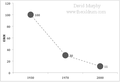 Figure 1. Plot of three estimations of EROI for U.S. oil and gas. Well, first, it means that, if the trend of declining EROI continues, society will be spending an increasingly larger chunk of their remaining energy to get more energy. This cycle is positively reinforcing: Declining EROI means that the net energy contained in each unit of energy delivered to society is decreasing over time, requiring the extraction of increasingly greater quantities just to meet societal demand â[integral][base '] With every barrel we pull out of the ground we propel ourselves further down this path, creating a more difficult situation for future generations. (note: I assume that the âo[ogonek]Best First Principleâo[caron] applies to this scenario, i.e. society is using the best resources (i.e. oil fields) first, then the second best, etcâo[oe]) More importantly, declining EROI also means that the amount of discretionary energy available to society is FAR less than that predicted by a Hubbert curve (Figure 2). The Hubbert curve represents the total gross quantity of energy available, and, as it is calculated, there are equal quantities of energy available on the left and right side of the peak. This, however, is only true in a gross sense. The net energy available (i.e. discretionary energy) is less. In other words, declining EROI means that there will be much less net energy extracted post-peak than pre-peak on the Hubbert curve. 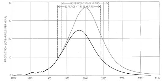 Figure 2. Hubbert curve as published in 1971. See here for a more detailed discussion of M. King Hubbert and this graph. To understand this in greater depth, I quantified this relationship by first creating a replicate of the Hubbert curve published in 1971 (Figure 2). I then applied the three point values of EROI over the past century (i.e. 1930 = 100:1, 1970 = 30:1, and 2000=11:1), and interpolated linearly the values between the points and into the future to a minimum EROI of 1.1:1. I have no a priori reason to believe that EROI has declined linearly or that it will decline to 1.1 and then level off, but it has certainly declined in the past and as long as it is declining the general results reported here are valid. I then used the following equation to calculate the percent of net energy available from the gross energy produced: Figure 3 shows the results of this analysis. Unlike the original Hubbert curve that shows equal quantities of gross energy resources on the left and right side, the Net Hubbert Curve is skewed so that most resources are on the left. For example, according to the original Hubbert curve, 50% of the energy resource is remaining when production levels reach the peak, but this is quite different for the Net Hubbert curve. Due to declining EROI, by the time peak production is reached, 73% of the net energy available is already used. 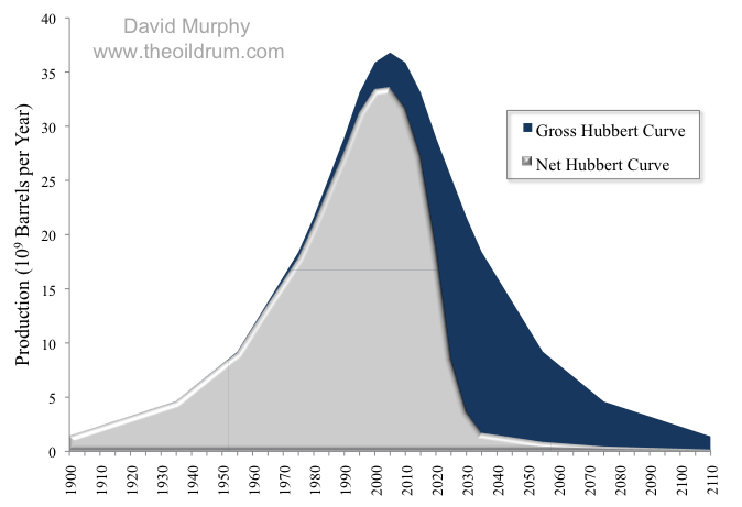 Figure 3. Gross and Net Hubbert curves, adapted from Figure 2. The implications of these results are vast, but in general, declining EROI is going to make it very difficult to meet the net energy needs of future society. Although this study may not be very precise, it does imply that if we have reached Peak Oil (and I think we have), that society has already spent quite a bit more than half of the net (or discretionary) oil energy that will ever be available. [The Oil Drum: Net Energy - Discussions about Energy and Our Future]11:53:38 AM |
|
http://paul.kedrosky.com/archives/2009/06/three_oilenergy.html 11:48:16 AM |
Educational Catchup Downunder. 11:08:02 AM |

|
What happens to the Australian labour market in recessions?. Jeff Borland has a splendid article (gated, sorry) in the latest Australian Economic Review on what happens to the labour market in recessions. From it, I learned: 1. The impact across industries differs greatly. In past recessions, employment tends to fall in agriculture, manufacturing and construction, but also tends to rise in [base ']Äòrecreation and personal services[base ']Äô, and sometimes also in the [base ']Äòcommunity services[base ']Äô industry. 2. In percentage point terms, youth unemployment tends to rise more than prime-aged unemployment in recessions, but the proportional increase is the same. For example, in the early-90s recession, unemployment rose from 10.4% to 18.4% for 15-24 year olds, and from 4.3% to 8.5% for 25-54 year olds. So both rates approximately doubled, but that represented an 8pp increase for kids, and a 4pp increase for adults. 3. In recessions, long term unemployment tends to increase more than short-term unemployment. 4. Unemployment inflows and outflows both increase. Jeff explains the puzzle.
5. According to 1997 time use data, 15-20% of unemployed people report job search activity on any given day, with the average time spend searching among those people being 80-100 minutes per day. Multiplying these numbers together, the average time spent job searching across all unemployed people is 16 minutes per day, or a little less than 2 hours per week. If you can get access to the article, it[base ']Äôs highly recommended reading. (xposted @ Core) [Andrew Leigh]2:38:29 AM |
Do Smart Parents Raise Smart Kids?. 8:49:07 PM |
|
Apple Posts $1.21 Billion Profit for Q2 2009. The weak economy is hurting Mac sales to professional and educational customers, but consumer sales and the iPhone and iPod touch have lifted Apple to another impressive financial quarter. Ending the second quarter of 2009, Apple reported a $1.21 billion profit on revenue of $8.16 billion, or $1.33 per diluted share (those numbers compare to a $1.05 billion profit on $7.51 billion in the year-ago quarter). Also contributing to the strong bottom line were low prices for components such as RAM, better freight and warranty costs, and better sales of high-margin products, all of which helped push Apple's gross margin to 36.4 percent (up from 32.9 percent last year). In a conference call with analysts, Apple Chief Financial Officer Peter Oppenheimer called it Apple's "best non-holiday quarter in history." The company reported $28.9 billion in cash on hand, noting that it's focusing on "preservation of capital" with that cash (and presumably not looking at any major acquisitions).
As part of the discussion of Mac sales, the question of netbooks arose during the call. Chief Operating Officer Tim Cook expressed Apple's opinion of the current netbook market, saying, "When I look at what's being sold in the netbook space today, I see cramped keyboards, terrible software, junky hardware, very small screens, and just not a consumer experience and not something that we would put the Mac brand on, quite frankly." As with his comments during the last quarter's conference call, Cook pointed out that Apple has "some interesting ideas in this space." He also pointed out that the features for which people are buying netbooks - Web browsing and email - can be accomplished with the iPhone or iPod touch. Led by strong sales of the iPod touch, Apple racked up 11.01 million iPod sales during the quarter, a 3 percent year-over-year improvement. During the call, Oppenheimer and Cook reiterated the strength of the App Store and the iPhone OS (which also runs the iPod touch) as fueling those sales, and reminded listeners that they expected the App Store to mark its 1 billionth download sometime on Thursday. (The billionth app was indeed downloaded on Thursday, by a 13-year-old in Connecticut.) Apple claims it owns 70 percent of the market for music players in the United States.
Apple is also delaying revenue recognition for sales of all iPhones after 17-Mar-09, which is when it announced the iPhone OS 3.0; current iPhones will be able to upgrade to the new operating system for free when it appears later this year. Unlike the last earnings call, this one didn't offer any incendiary questions or statements. Only one mention of Steve Jobs's health came up, and that was as an aside: Oppenheimer said, "We look forward to Steve returning at the end of June." Analysts also tried to elicit comments about possible legal skirmishes over the Palm Pre and whether it violates Apple's intellectual property (or whether Apple is infringing on Palm's patents), which prompted Cook to end the call with a generic statement about how competition is healthy for the industry and that "we think it's best that other companies invent their own stuff." Copyright © 2009 Jeff Carlson. TidBITS is copyright © 2009 TidBITS Publishing Inc. If you're reading this article on a Web site other than TidBITS.com, please let us know, because if it was republished without attribution, by a commercial site, or in modified form, it violates our Creative Commons License.  MARK/SPACE, INC: Take it with you! The Missing Sync makes MARK/SPACE, INC: Take it with you! The Missing Sync makesit easy to synchronize contacts, calendars, notes, photos and more from your Mac to your BlackBerry, Palm OS, or Windows Mobile phone. <http://www.markspace.com/bits> 8:10:09 PM |
|
Australia’s $650 million Community Infrastructure Grants. This has come out of the blue - $650 million Jobs Fund announced by the Rudd Government to support local jobs, build skills and improve facilities in local communities. It is part of the Rudd Governmentâo[dot accent]s Jobs and Training Compact - includes three streams: $300m for Local Jobs to invest in community projects of up [...]  [Investment & Innovation Forum] [Investment & Innovation Forum]5:48:01 PM |
|
Jobs safe after Pontiac dumped: Holden. CAR maker Holden will lose one of its biggest export models with a move by United States parent company General Motors to dump the Pontiac brand. [Herald Sun | Breaking News] 11:07:32 AM |
|
OECD figures show 'flash flood' stimulus not working. The Federal Opposition says the latest report on the world economy by the OECD shows that the United States is the only country to have spent more than Australia on economic stimulus packages. [ABC News: Breaking Stories] 4:26:08 PM |
|
U.S. Plan Sees Easing of G.M. to Bankruptcy. The government hopes to avoid court chaos by persuading at least some creditors to agree to a plan that would cleave General Motors into two pieces. [NYT > Business] 3:58:22 PM |
11:32:37 PM |
||||||||||||
|
Low-paid workers, changing patterns of work and life, and participation in VET. This item includes an audio recording of an interview with researcher Barbara Pocock; the accompanying interview transcript; and the occasional paper itself. In this interview, Steve Davis talks with researcher Barbara Pocock about her paper, 'Low-paid workers, changing patterns of work and life, and participation in vocational education and training'. This paper outlines the issues emerging from the first year of research undertaken by University of South Australia's Centre for Work + Life on what influences people's decisions to participate in vocational education and training, particularly for low-skilled and low-paid workers (that is, those earning less than $15 per hour). [edna] 11:22:39 PM |
|
Jon Stewart:
10:51:04 PM |
||||||||||||
|
They took our jobs. The Australian Government intends to head into the G20 meeting in April with strong warnings against the dangers of growing economic nationalism around the globe, so we should not expect the Government to exhibit any such traits in the lead up to the London meeting.¬[sgl dagger] On Sunday morning Wayne Swan was offered the chance to pillory ANZ for out-sourcing 500 back office jobs to India.¬[sgl dagger] He was asked on the ABC Insiders program¬[sgl dagger]whether the Government was getting enough in return for the financial guarantees provided to the banks, given that jobs are being sent off-shore.¬[sgl dagger] Swan’s reply was reassuring in its economic liberalism.¬[sgl dagger]¬[sgl dagger]Swan said that the guarantees and off-shoring of jobs were unrelated issues, and he only urged banks to look after their employees.¬[sgl dagger] So far so good.¬[sgl dagger] But then on Monday we hear that the Government is to slash Australia’s skilled migrant intake.¬[sgl dagger] ¬[sgl dagger]This is a bad¬[sgl dagger]decision on every level.¬[sgl dagger] It trashes the Government’s credibility in arguing against economic nationalism; it restricts the flow of valuable human capital into Australia; and it pulls up the ladder people who are in the pipeline and could reasonably have expected to come to Australia this year.¬[sgl dagger]¬[sgl dagger] Josh Gans explains below that there is little or no evidence that immigration increases either unemployment or rents in a¬[sgl dagger]recession.¬[sgl dagger] ¬[sgl dagger] We are a nation of immigrants.¬[sgl dagger] Apart from our¬[sgl dagger]indigenous¬[sgl dagger]population, everybody who lives in Australia is descended from immigrants (and/or convicts).¬[sgl dagger] Our immigration policy has served the nation fantastically well and should¬[sgl dagger]not be¬[sgl dagger]used as a semi-annual labour market policy instrument (the skilled immigration quota increased substantially only 9 months ago). The Government might just as easily have announced that in the global war for talent the GFC¬[sgl dagger]presents a unique opportunity for Australia to bring in a wave of talented and energetic immigrants that will carry us forward for decades.¬[sgl dagger] It might have announced that in the interests of up-skilling the economy and solving the demographic problems of a greying population, skilled migration will be increased by 100% for the next three years.¬[sgl dagger] Skilled immigration is like adrenaline to any society and an opportunity to attract this much talent is unlikely to present itself again, so lets go for it.¬[sgl dagger] But, alas no.¬[sgl dagger] Instead we have a sop to ACTU lobbying that does a lot of harm and and very little good. 2:13:16 PM |
|
When Good Leaders Hit Bad Times. In early-1993, Australian unemployment peaked at nearly 12%. In 1992-1995, six of Australia’s eight states and territories ousted their government. By contrast, unemployment averaged 5% in 2003-2006. In these years, no state or territory government was ousted from power. In Australian politics, conventional wisdom has it that the state government oustings of the early-1990s were due to bad leadership, while the victories of the early-2000s were due to skill. But could it be that Carr wasn’t more skillful than Cain & Kirner, just luckier? In a paper that we released last year, Mark McLeish and I showed that Australian state governments were more likely to lose office when the national economy turned sour.* To check that our results weren’t being driven merely by the modest contribution that state leaders make to economic performance, we were able to show that our results held up even if we only used a purely unrelated source of growth - the US economy. Here’s a chart that shows our central result: the bars indicate the share of state governments losing office in each 5-year period, while the line is the US unemployment rate.
Why do Australian voters turf out their state governments when the US economy tanks? The answer seems to lie in something psychologists call ‘the fundamental attribution error’, which is the fact that humans aren’t very good at separating situational factors from ability when making assessments. So for example managers tend to be bad at taking task difficulty into account when assessing their workers, sports fans don’t appropriately adjust for field conditions when judging ability, and shareholders tend to overpay CEOs when the market booms. Consequently, it isn’t all that surprising that voters aren’t very good at separating out the component of economic growth that lies within the control of state politicians from factors outside their control. Our results suggest that a 1 percentage point rise in the unemployment rate lowers a Premier’s chances of re-election by 3-5 percentage points. So the 1 1/2 percentage point increase in the Queensland unemployment rate over the past year has lowered Premier Bligh’s chances of re-election on the weekend by 5-8 percentage points (the average Premier in our sample had a 66% chance of re-election). But the fundamental attribution error doesn’t just affect Australian state elections. In earlier work, Justin Wolfers showed that luck affected US state elections in a similar way (though Australian voters seem a little more gullible than their US counterparts). And in work on national elections, I’ve recently shown that when the world economy slumps, national leaders tend to get voted out of power. Here’s a chart plotting world growth against re-election rates over recent decades (I exclude the US and Japan, since they make up a large share of world GDP).
We don’t know the optimal turnover rate of governments, so it could be that voters in national elections get rid of too many governments when the world economy slumps. Or perhaps they axe too few when the world economy booms. But either way, some more national leaders are likely to join the ranks of the unlucky unemployed. One last prediction. I’m guessing that the prognostications of the pundits will over-emphasise competence and under-emphasise luck. After all, it’s not just voters who commit the fundamental attribution error. * As part of the Australian state elections paper, we also produced estimates of Australian state unemployment rates from 1913-2006, which are available here. [Andrew Leigh]1:25:56 PM |


|
Sony Reader Gets 500,000 Free Public Domain Titles from Google. Google made a practical move with some of the 7 million books it's scanned from academic collections by making 500,000 titles with no remaining copyright protection available to Sony for its electronic book device, the Reader. Reports indicate only books from 1922 or earlier were included, as 1922 is the latest date for which public domain status is entirely clear. (Many works published after 1922 are also in the public domain, but each work has to be researched individually to determine its status.) Earlier this year, Google added an option to view but not download 2 million public domain books on the iPhone; see "More Ebooks Available for the iPhone/iPod touch," 2009-02-09. Think of it like iTunes song purchases versus a Pandora stream. Google's program to scan books ran afoul of publishers and authors' concerns about the right to scan and archive titles, and the legality of snippets being displayed from these scanned works. A preliminary settlement between Google and various interested parties should make millions of books available for viewing, printing, download, and purchase in the coming months; these titles could also wind up being previewable and for sale on the Reader. (See "Authors and Publishers Settle with Google Book Search," 2008-10-29.) It's clear that Google has chosen a side (for now) between the two giants of electronic book readers, Sony and Amazon. The Wall Street Journal notes Sony said its Reader sales are at 400,000 and reported that Citigroup estimated Amazon Kindle sales at 500,000. The Kindle 2, introduced in February, improves on the design of the original device and has a faster screen refresh. Amazon released Kindle for iPhone shortly after the Kindle 2 hardware. Amazon offers 245,000 books for sale along with subscriptions to dozens of magazines and newspapers, and hundreds of blogs. The iPhone software can download only books, not subscriptions. That may change with Apple's iPhone 3.0 software, which now enables in-application subscriptions and purchases. Lest we forget, Project Gutenberg's volunteers have been assiduously typing, scanning, and correcting out-of-copyright works for many years. Its catalog, now at 27,000 books, includes downloads in text and other formats, including a DRM-free ePub format that both the Reader and Kindle 2 can handle. Affiliated and partner projects bring a grand total to 100,000 titles. While Project Gutenberg has a fraction of what Google has made available, the quality should be higher, as works have been prepared for accuracy instead of volume, and represent works of a great likelihood to be interesting to a modern audience instead of historians and researchers. Copyright © 2009 Glenn Fleishman. TidBITS is copyright © 2009 TidBITS Publishing Inc. If you're reading this article on a Web site other than TidBITS.com, please let us know, because if it was republished without attribution, by a commercial site, or in modified form, it violates our Creative Commons License.  Speak up with MacSpeech Dictate! Get the all-new MacSpeech Speak up with MacSpeech Dictate! Get the all-new MacSpeechDictate with spelling and phrase training. Speech recognition so good, about the only thing it can't do is speak for you. Learn more: <http://www.tidbits.com/about/support/macspeech.html> 12:29:13 PM |
|
As Planet Warms, Poor Nations Face Economic Chill. A rising tide is said to lift all boats. Rising global temperatures, however, may lead to increased disparities between rich and poor countries, according to a recent economic analysis of the impact of climate change on growth. 12:24:19 PM |
|
Unemployment rate on upwards trend. The unemployment rate data published this morning shows a not surprising continuing rise in the unemployment rate. The headline rate is 5.2%, up from 4.8% a month ago, and a low of 3.9% last year. It is well to remember that this is still a very low unemployment rate, but the worrying issue is that the rate is heading up fairly quickly, that full time job losses are large, and that layoffs continue at a fairly rapid pace. In the US the unemployment rate has risen very quickly to a current rate of 8.1% - as recently as April last year the US unemployment rate was below our current 5.2% rate. So it is appropriate for the government to be spending money to try to slow the rate of unemployment growth. But with the latest payments going out to families and individuals it was interesting to see two recipients on last nights ABC news. One punter was spending the payment on an overseas holiday, while the other was buying a new PC. Both punters are probably creating more jobs in Thailand than in Australia. Once again, the most effective way to create jobs is not to give away handouts, but to spend on infrastructure. 6:37:25 PM |
Last update: 16/8/09; 4:02:46 PM .
![]()

![]()
![]()
![]()