I realize the title of this post is a tad over the top. However, it's actually pretty darn close to the truth. I spent today in a one day course (with a thousand of my closest friends) presented by Edward Tufte - one of the great minds of data analysis and the presentation of data analysis. I realize that to the non-initiated, data analysis and data analysis presentation may seem to be about as interesting as watching paint dry. However, it's an unbelievably compelling field and Tufte does a wonderful job of letting us all in on the secret: data analysis and presentation is fascinating and of critical importance.
I've been a Tufte fan (disciple?) since the mid-80's when I purchased his first book, The Visual Display of Quantitative Information. (How's that for a whiz bang title?). I instantly fell in love when I read that book - the book itself is a publishing masterpiece and the content is revolutionary and eye opening. It was rated in the top 100 of non-fiction books of the 20th century and it's that good.
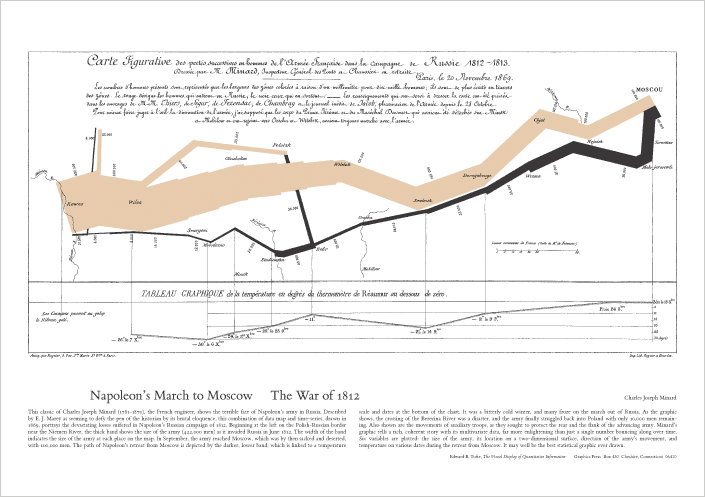
Today's course was really quite good - a full day of Tufte - and he is a very engaging and compelling speaker. He's as we say in the tech biz - high bandwidth. Or as he would say, "high resolution". Lots of data - presented in a way that can be parsed and discussed. In fact discussion is a big part of his credo, data should be presented in a manner that allows for thorough discussion, questioning, and understanding. Particuarly germane to that principal were his analyses of the missteps in analysis and presentation of analysis in both the Challenger and Columbia shuttle accidents. He was part of the post mortem teams for both events and the errors in communication of important data analyses resulted in literally catastrophic events.
Anyhoo, I could go on and on. But, what a fabulous day.
Here's a reproduction of his favorite piece of data analysis and presentation. I have framed copy on my office wall at work (Mom gave it to me 20 years ago!!!!!).
Napolean's March to Moscow: The War of 1812:
9:28:36 PM 
|